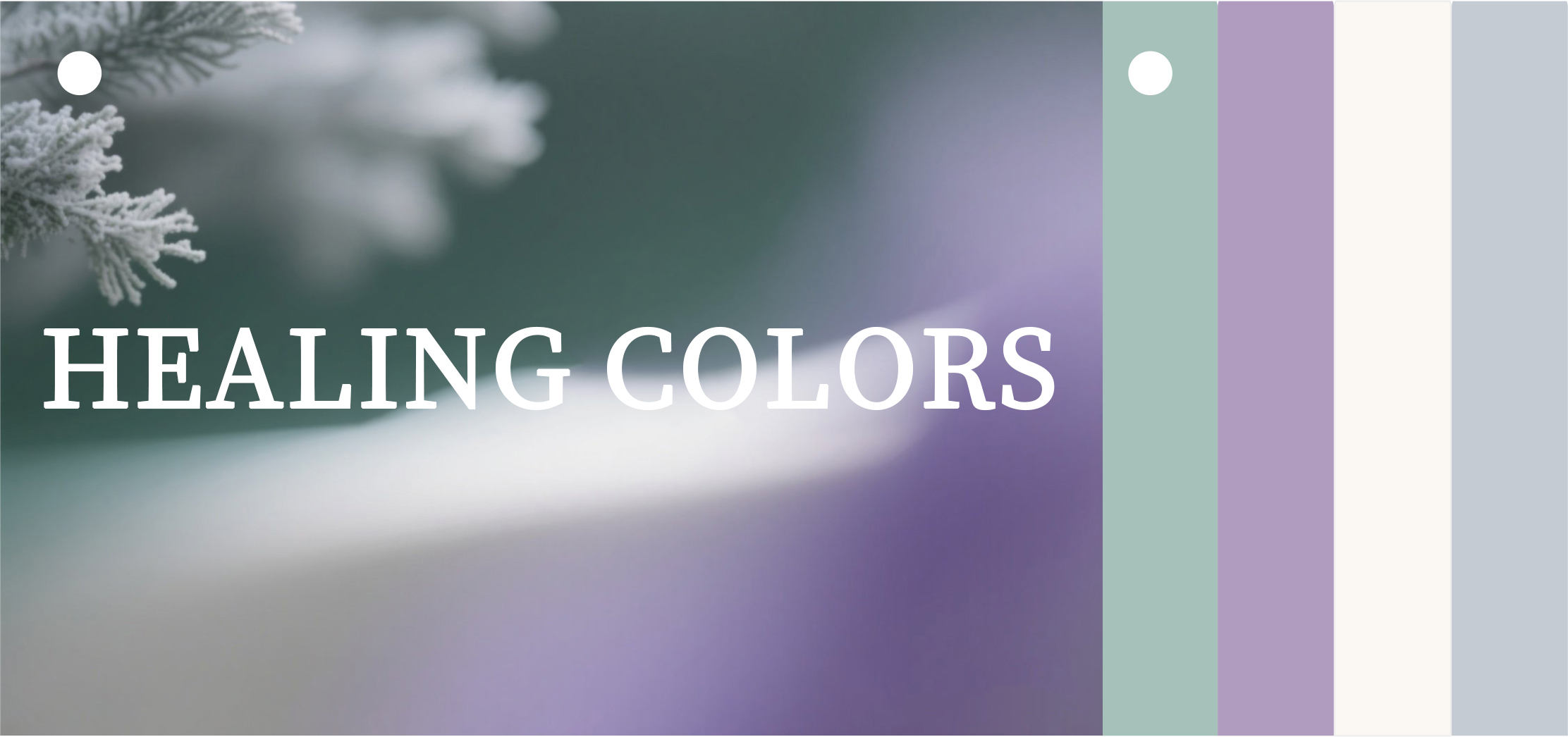
In our fast-paced lives, colors act as a silent language, quietly influencing our emotions and perceptions. "Healing Colors," centered around low-saturation, soft tones, mimic natural textures and warm life scenes to help alleviate anxiety and soothe the mind.
The healing power of color transcends visual imagination—it permeates life’s details through material tactility and artisanal execution. Acetate sheets, a material merging aesthetics with functionality, have become an ideal medium for healing design, thanks to their rich color expression and eco-friendly qualities.
Below, we recommend four groups of soothing color palettes, letting colors become your "soul elixir."
「Nature-Breathing Healing Palette」
Misty Pine Green — The Forest's Exhale in Haze

Visual Code: RGB 163, 177, 138. A grayish pine green infused with the depth of fir needles. After a 30% saturation reduction, it sheds the sharpness of traditional greens, evoking nature filtered through morning mist.
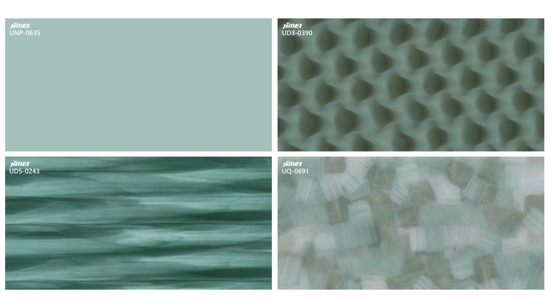
Material Soul: Pairs with milky acetate sheets, mimicking the matte texture of dew-kissed leaves.
Pearl White — A Soft-Glow Filter
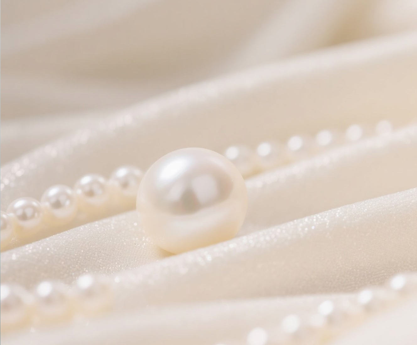
Visual Code: RGB 245, 242, 234. A creamy white blended with 5% warm yellow and 3% gray, preserving purity while adding warmth.
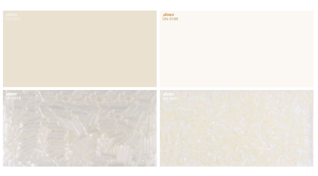
Material Soul: Semi-transparent acetate sheets emulate the luster of a pearl oyster, creating a soft-focus effect as light passes through.
Moonlit Silver Gray — A Gentle Anchor in Cosmic Dust
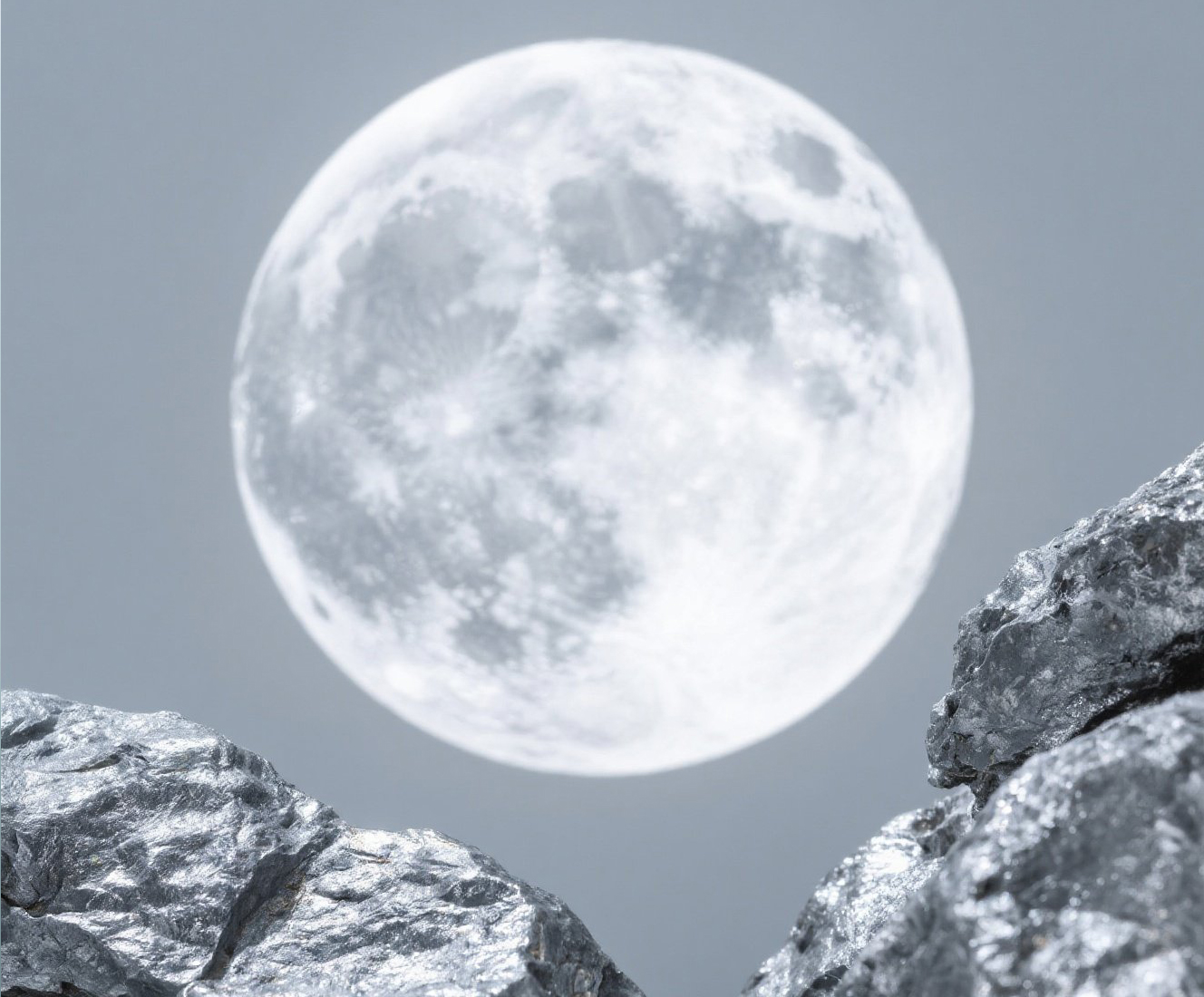
Visual Code: RGB 192, 192, 192. A precise balance of silver (40%) and gray (60%), stripping away metallic coldness to reveal the warm, matte feel of "moonlight on aged stone," perfect for serene nighttime scenes.
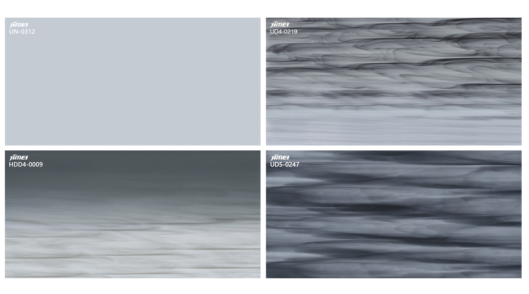
Material Soul: Acetate’s inherent transparency veils the gray in a fine matte filter, softening monotony while retaining psychological stability—an anchor radiating quiet strength.
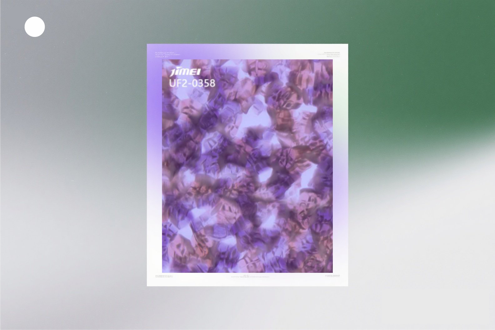
Lavender Purple — A Color Specimen of Time-Lapsed Beauty
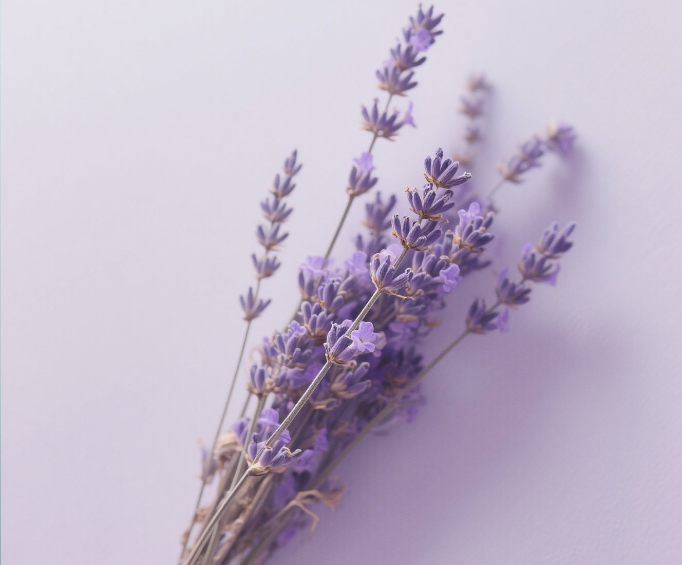
Visual Code: RGB 181, 126, 220. Purple blended with 30% gray and 20% white, lowered to 45% saturation. Captures the faded elegance of dried lavender bouquets, preserving the mystique of purple while adding timeless tranquility.
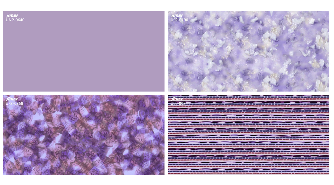
Material Soul: Lavender-toned acetate embodies a "semi-transparent, time-softened beauty." Its grain appears to encase summer lavender fields in crystal clarity. Light permeability lends the purple an ethereal lightness, as if morning dew on petals were eternally suspended—infusing the color’s spiritual allure with the eternal calm of a "dried botanical specimen."